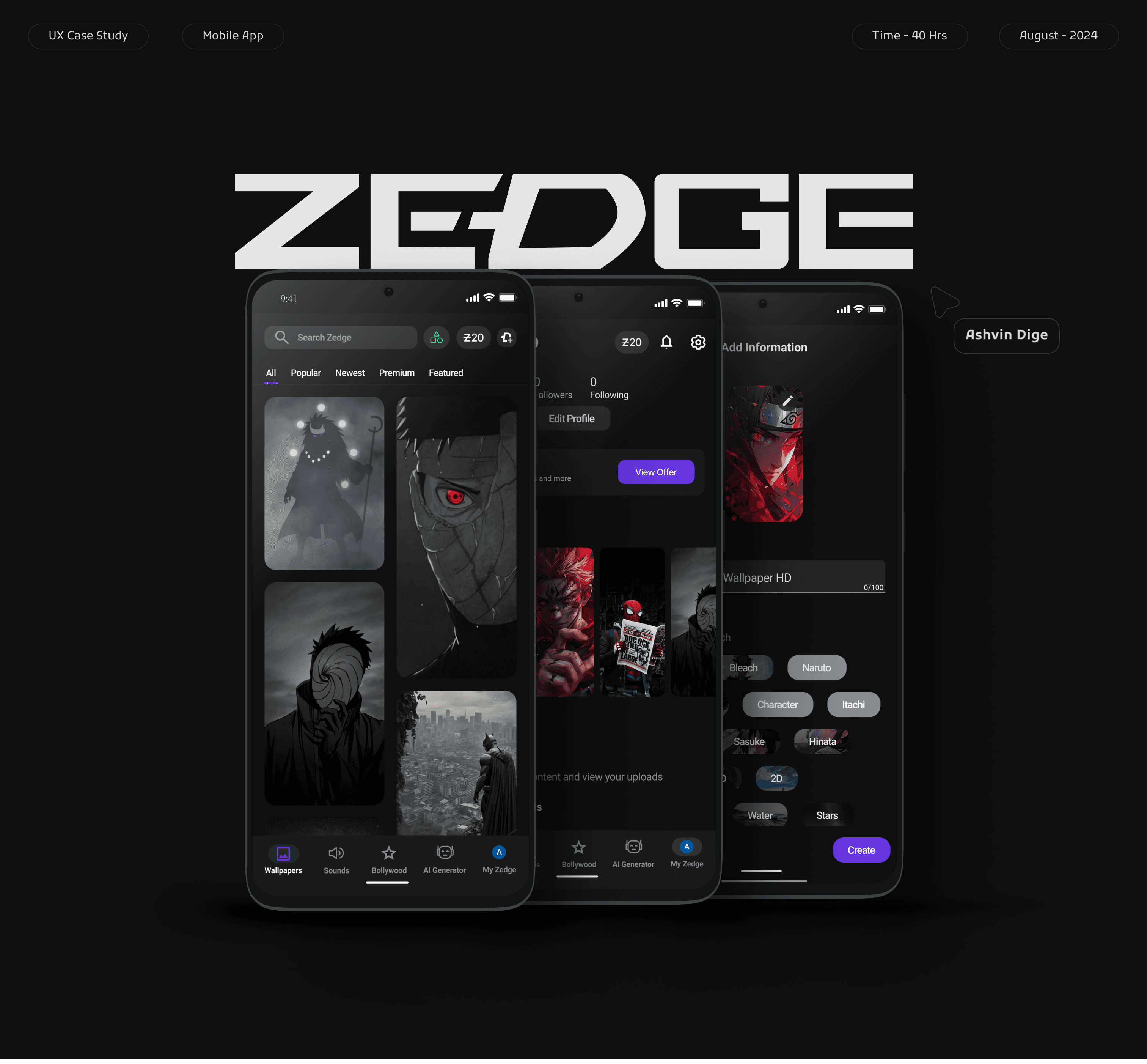
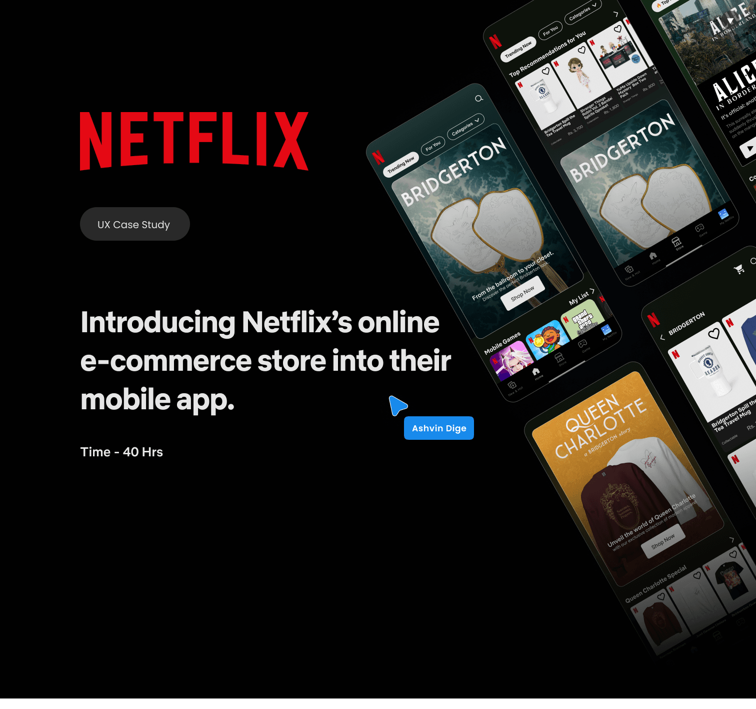
From Idea to Impact: Building the Pixel Designathon Experience
01. Overview
As
UI/UX Lead for GDGC
,I designed their first Designathon
website over two months. This platform enabled participant registration, problem statement selection,
and solution submission via UX Hack.
Applying user-centered
design,
I delivered an intuitive solution,
balancing multiple
responsibilities to ensure a successful event.
Note: Balancing organizing duties, I designed the website in phases over a month period.

02. ROLE
Managing my own expectations
Juggling core committee responsibilities, including managing team members and project tracking, made finding dedicated design and research time challenging. Despite feeling overwhelmed at times, I persevered, committed to delivering my best work. However, the design process was further complicated by the difficulty in aligning my design aspirations with the available time and resources.
Outcomes
•
Resilience and Perseverance: The project demonstrated an ability to overcome challenges, manage competing priorities, and deliver results under pressure.
•
Realistic Project Scoping: The experience highlighted the importance of aligning project scope with available time and resources for future projects.
•
Improved Time Management Insights: The challenges faced provided valuable lessons for improving time management and resource allocation strategies in future endeavors.
•
Compromise and Adaptation: The design process required compromises due to constraints, demonstrating adaptability and the ability to prioritize essential features.
03. Key Challenges
Chaos Meets Simplicity
Challenge
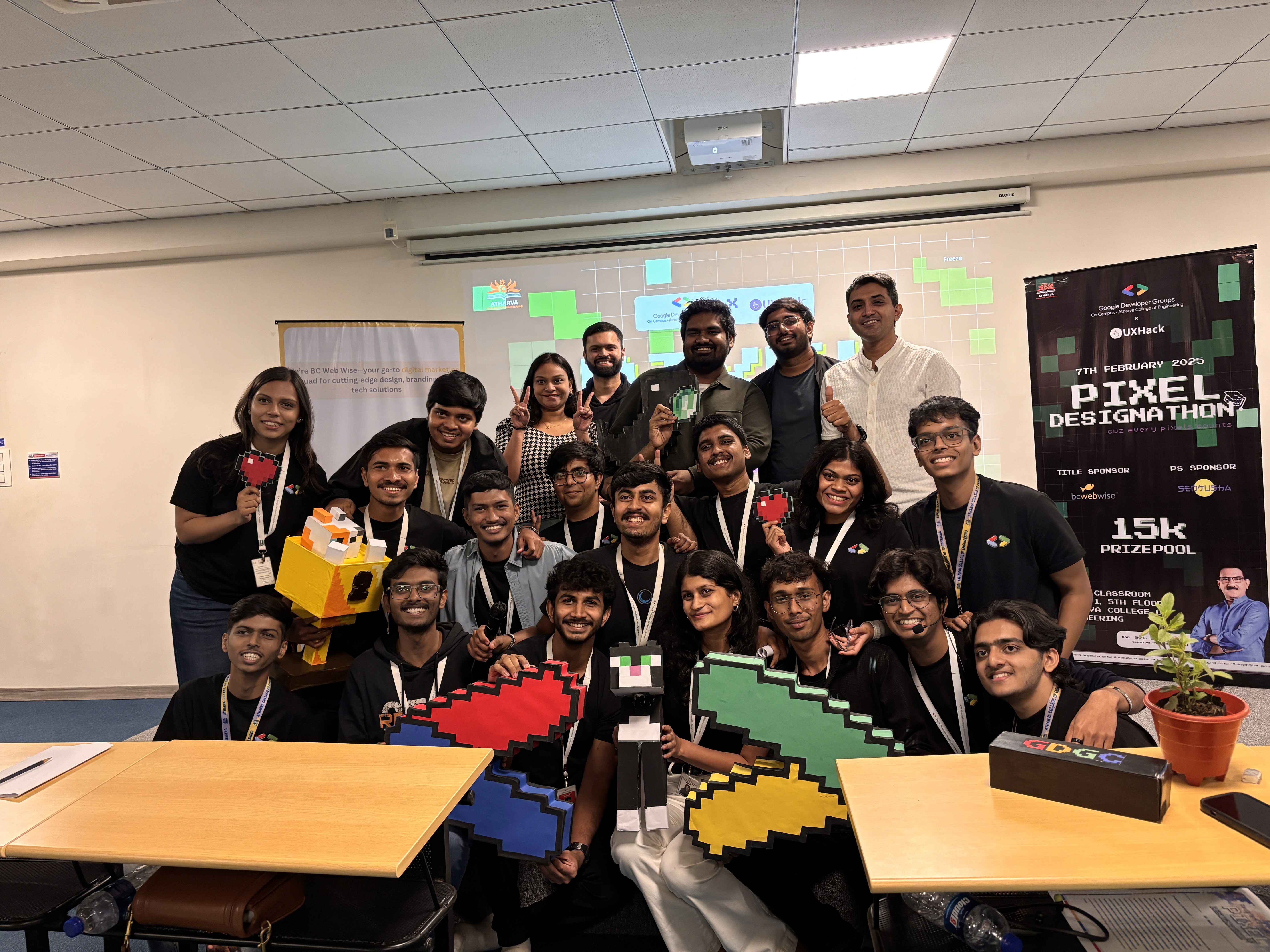
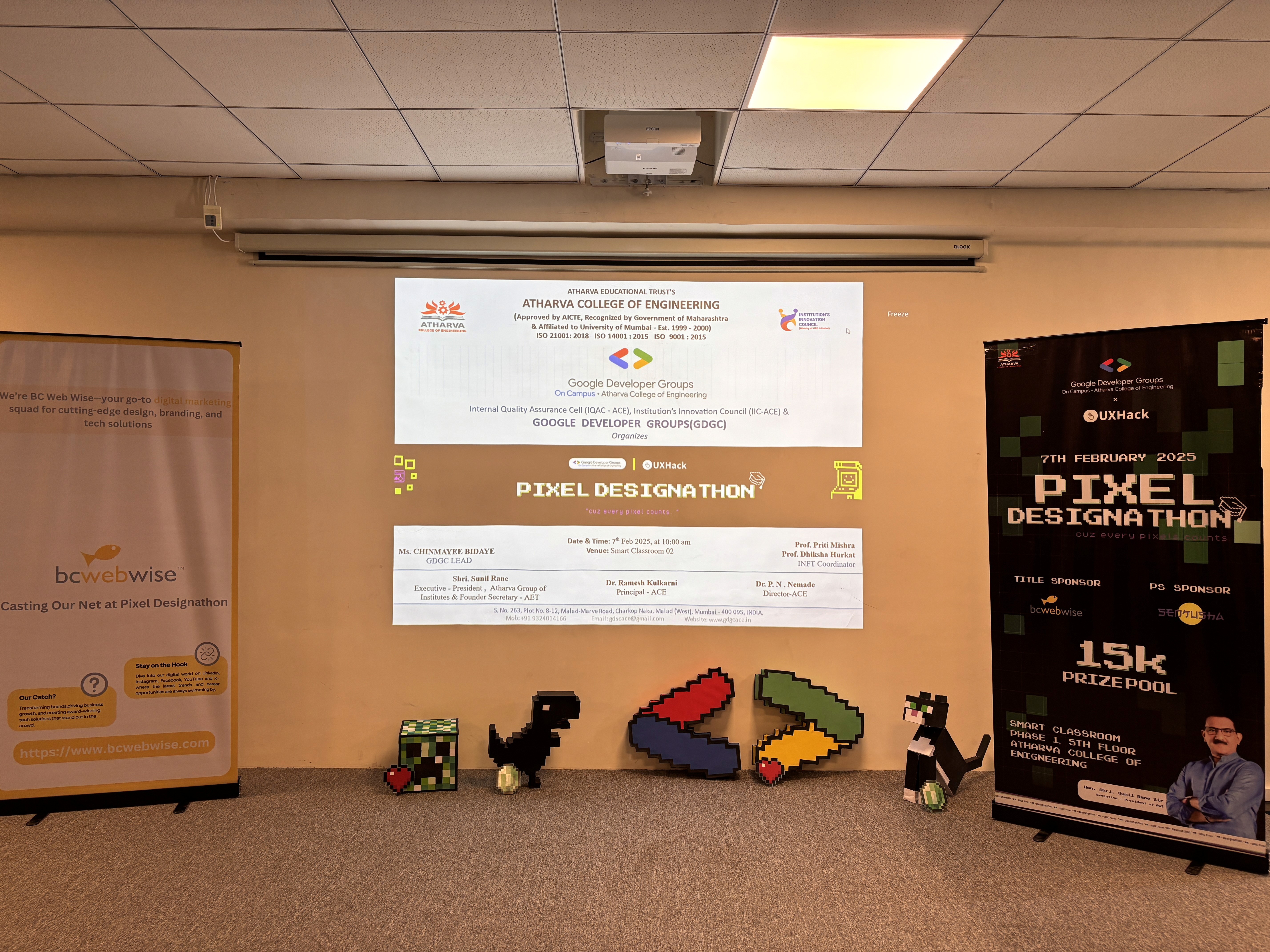
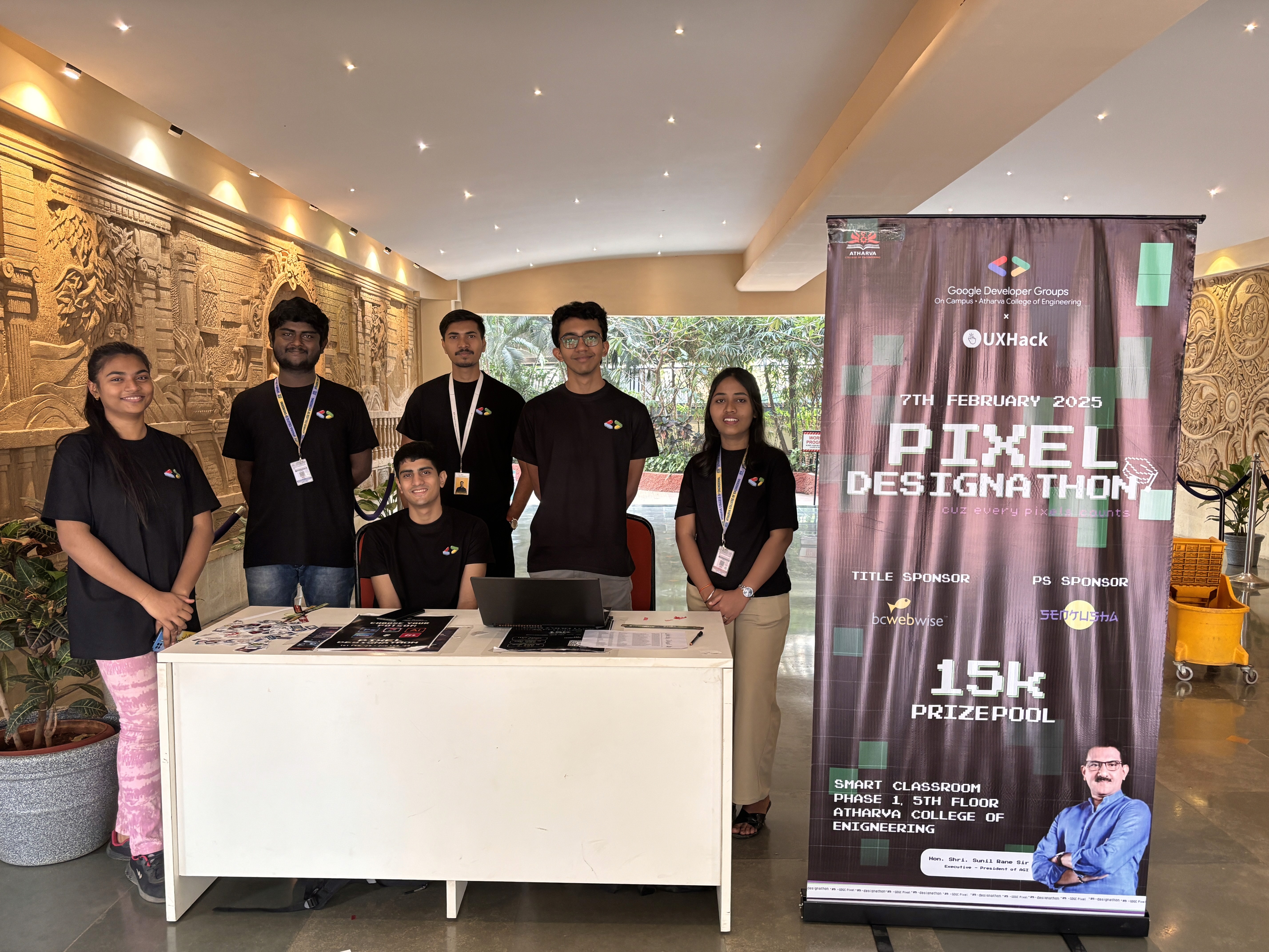
Given that this was the first design hackathon, the website's visual appeal was paramount. There was significant pressure to create a captivating online presence that would meet the high expectations for such an event.
•
High visual expectations
•
First Designathon pressure
•
Captivating online presence crucial
Solution
Realising I needed a game plan to stay sane and productive, I
turned to the 60-40 Rule to prioritise my efforts:
•
60% on the highest priority (Visual aspect)
•
40% on the second priority (Registration experience)
This wasn't a rigid rule but gave me a solid framework to
manage my time and energy effectively.
The 60-40 Rule
60
%
%
40
Weekly Breakdown
I Organized my days around 90- to 120-minute 'deep work'
sessions. While surprises did pop up, I made sure to reserve
at least two blocks for high-priority tasks. The rest of the day
was more flexible, adapting to what team needed from me.
Monday- Friday
•
4-6 hours: In college for both lectures and managing the team
•
2-3 hours: Designing based on requirement.
Saturday-Sunday
•
Morning: Visual designs and graphic designs for posters and all
•
Afternoon: User research and planning
Dealing with Reality
No week ever went exactly as planned. Here's how I handled
the curveballs:
•
Urgent Requests: I built in a buffer during afternoon
sessions for any urgent issues. If something couldn't wait,
it got slotted in here.
•
Shifting Priorities: If a project needed more attention, I'd
adjust my 60-40 split and keep team in the loop.
•
Energy Levels: I'd tackle high-energy tasks (like creative
design work) when I was at my peak and saved less
demanding tasks (like documentation) for when I needed a
breather.
This system wasn't perfect, but it helped me keep all the
plates spinning without losing focus. Flexibility within a
structured framework was key.
05. UX DESIGN
No Scenic Route,
Just Speed
Solving core problems goes beyond design—it
starts with effective resource allocation. With a
fresh perspective, I identified key process
improvements to accelerate the work.
Understanding the problem
WHO ARE WE Targeting ?
Our user base comprises students from various colleges. Since UX design in engineering is relatively uncommon, we specifically targeted this audience.
Final year college students seeking internships or part-time employment opportunities.
Students in their second and third years of study looking to build their design portfolios
WHAT ARE WE SOLVING?🧠
Lack of opportunities: Providing a platform for these students to showcase their design skills and gain practical experience.
Limited exposure: Connecting these students with industry professionals and design mentors.
Community building: Fostering a community of aspiring UX designers within the engineering college.
Valuable Insights
Problem
Balancing Aesthetics and Usability: Ensuring the website was visually appealing while remaining intuitive and easy to navigate for first-time participants.
Clear Communication: Effectively communicating rules and guidelines through both the website and a downloadable PDF.
Streamlining Submission & Problem Statement Release: Navigating tight deadlines and resolving integration issues with our collaborator's platform, UX Hack. risked building features that might miss the mark.
Solution
Prioritized Visual Hierarchy: Implemented a clear visual hierarchy using typography, color, and spacing to guide user attention and highlight key information.
Regular Team Meetings: Conducted regular team meetings to discuss progress, address challenges, and ensure alignment with project goals.
Simplified Navigation: Streamlined the menu structure, reducing the number of clicks and making it easier for users to find the information they needed.
Payoff
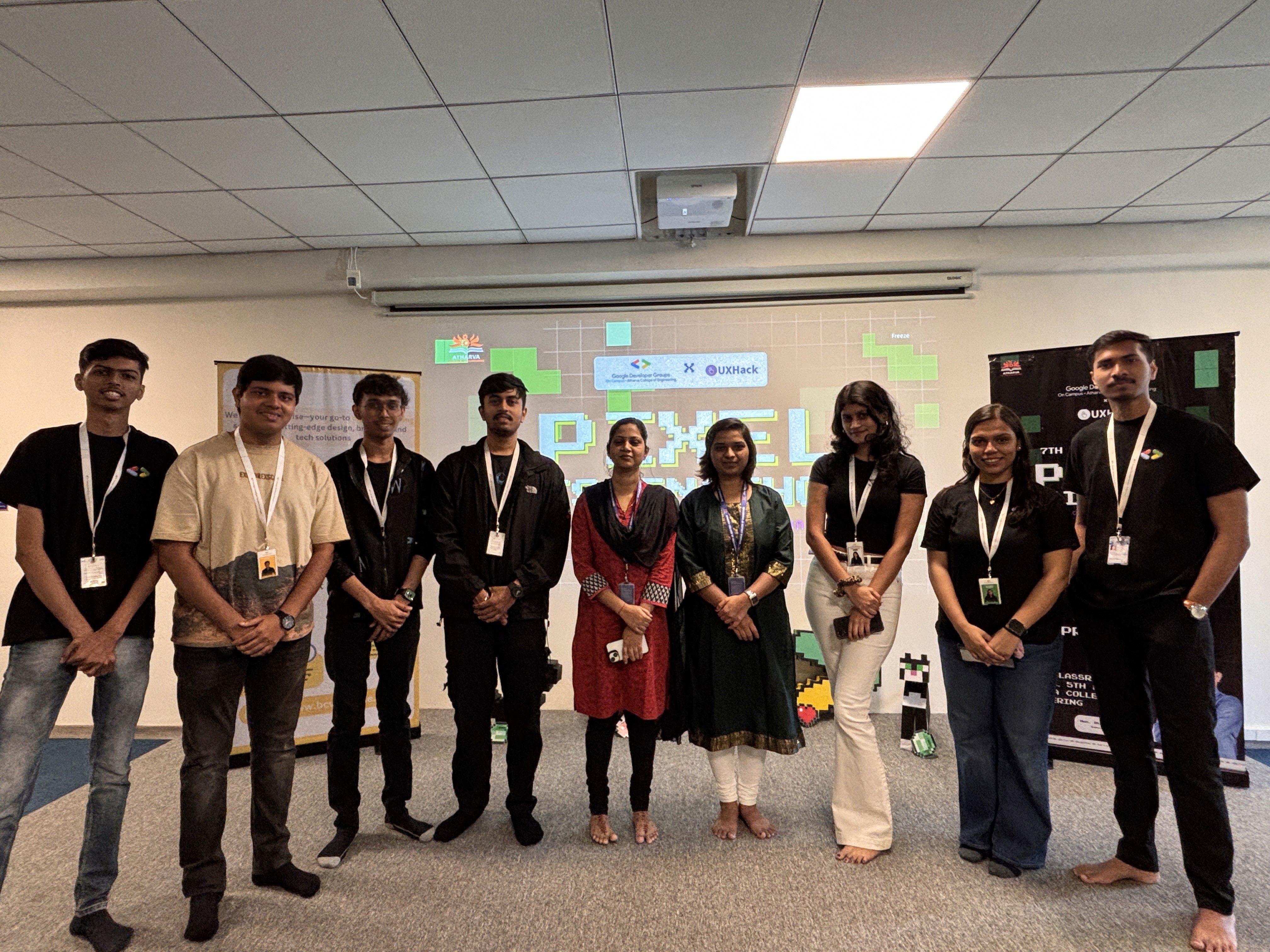
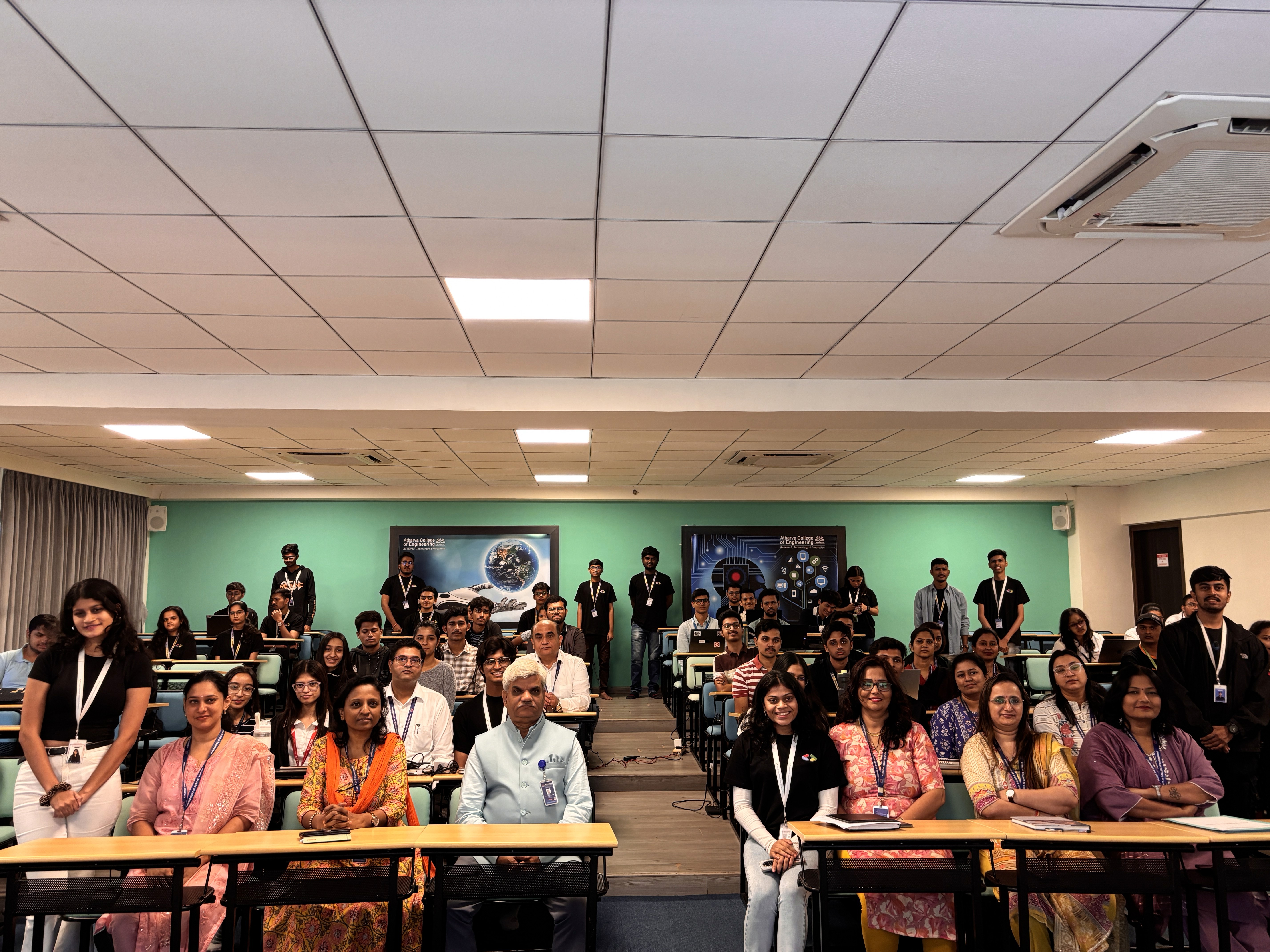
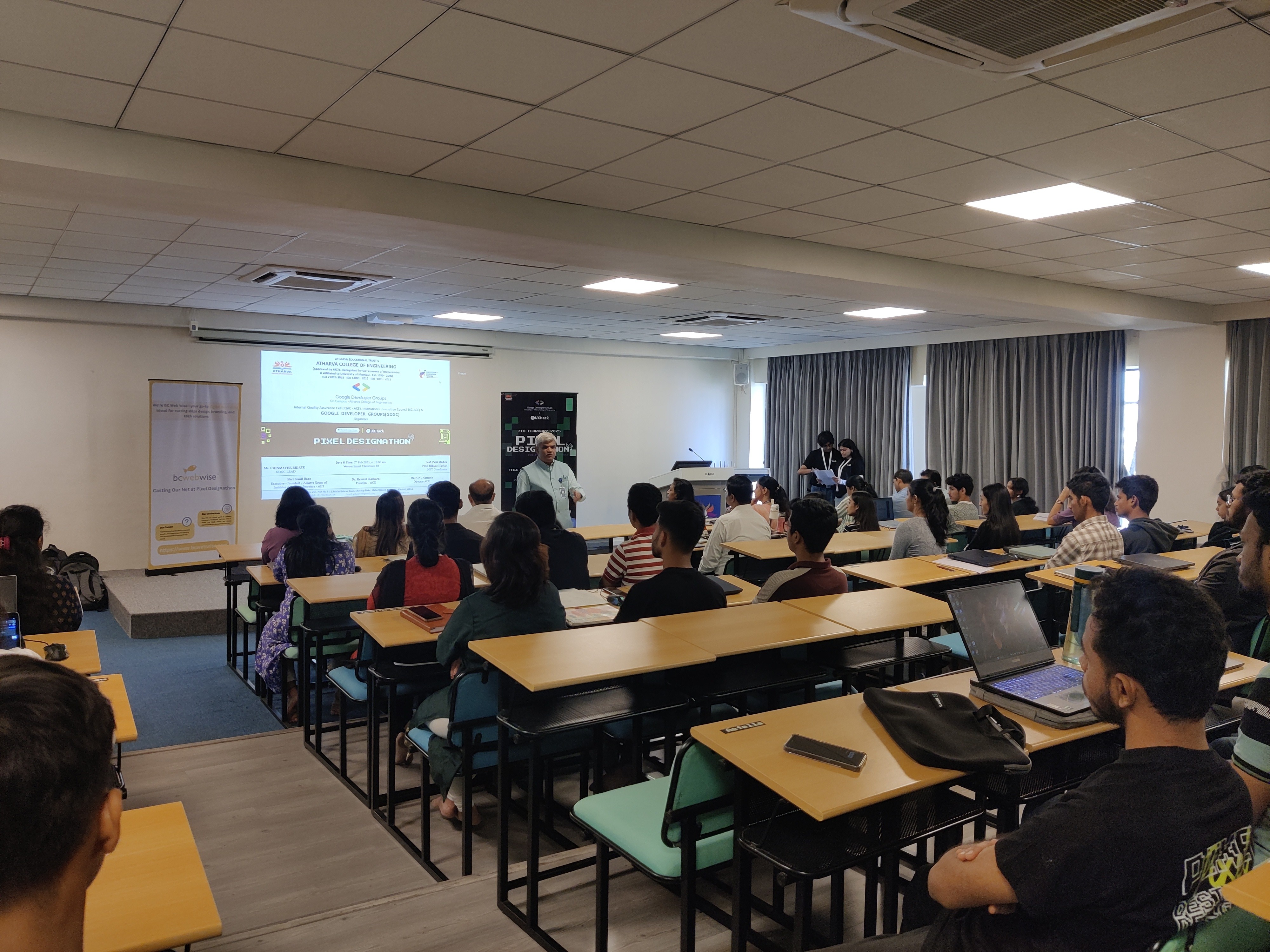
Successful Event Registration: The streamlined registration process and clear communication of event details resulted in a high number of participant registrations and a successful turnout for the Designathon.
Enhanced Brand Image: The professional and visually appealing website enhanced the GDGC's brand image and credibility within the college community.
Increased User Engagement: The improved navigation, clear information architecture, and visually appealing design made the website more user-friendly, leading to increased user engagement and a higher likelihood of participants exploring the website and completing desired actions (e.g., registering, viewing problem statements).
UX Strategy
60% Of Art
Our UX strategy centres on
Aesthetic-
Usability Effect
, which states:
“Users often perceive aesthetically pleasing design as design that’s more usable.”
An aesthetically pleasing design creates a positive response in people’s brains and leads them to believe the design actually works better. People are more tolerant of minor usability issues when the design of a product or service is aesthetically pleasing.
40% Strategy
This part of UX strategy centres on Paradox of the Active User, Which states : “Users never read manuals but start using the software immediately. “
Users are often motivated to complete their immediate tasks and therefore they don't want to spend time up front reading documentation.
This paradox exist because users will save time in the long term if they take the time to optimize the system and learn more about it.
Design Foundation
The Power of Aesthetics
When users have a positive emotional response to visual design, it makes them more tolerant of minor usability issues. This effect is a major reason why a good user experience can’t just be functional. An attractive visual design isn’t just “nice to have” — it plays a critical role in how your users perceive your product.
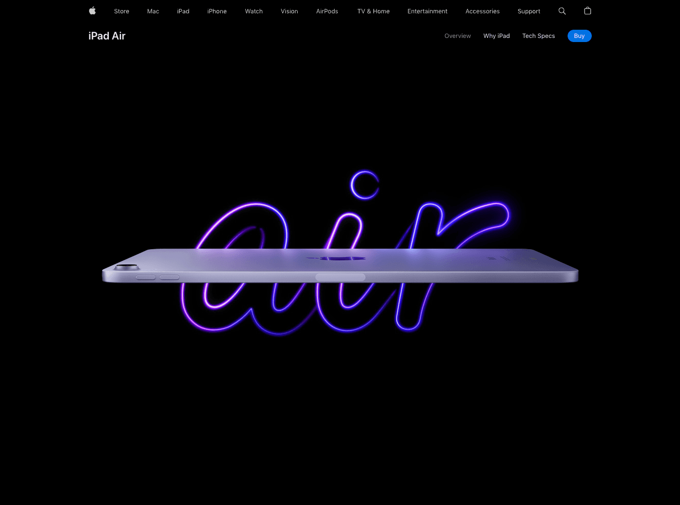
The UX Model (Apple’s Website)
The Design
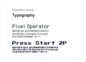
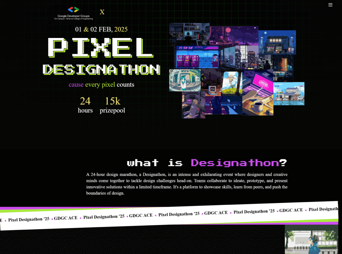
Font: We chose Pixel Operator and Press Start 2P for their visual similarity to our theme and flexibility. Alternative character options were selected to improve legibility.
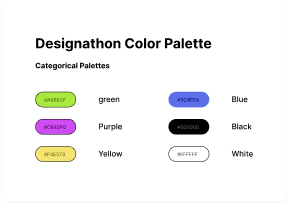
Colours: The color palette, featuring green for success, purple for luxury, yellow for attention, blue for trust, and black & white for contrast, enhances user experience by providing clear visual cues and reinforcing brand identity.
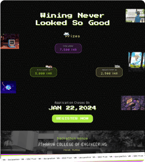
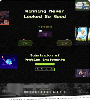
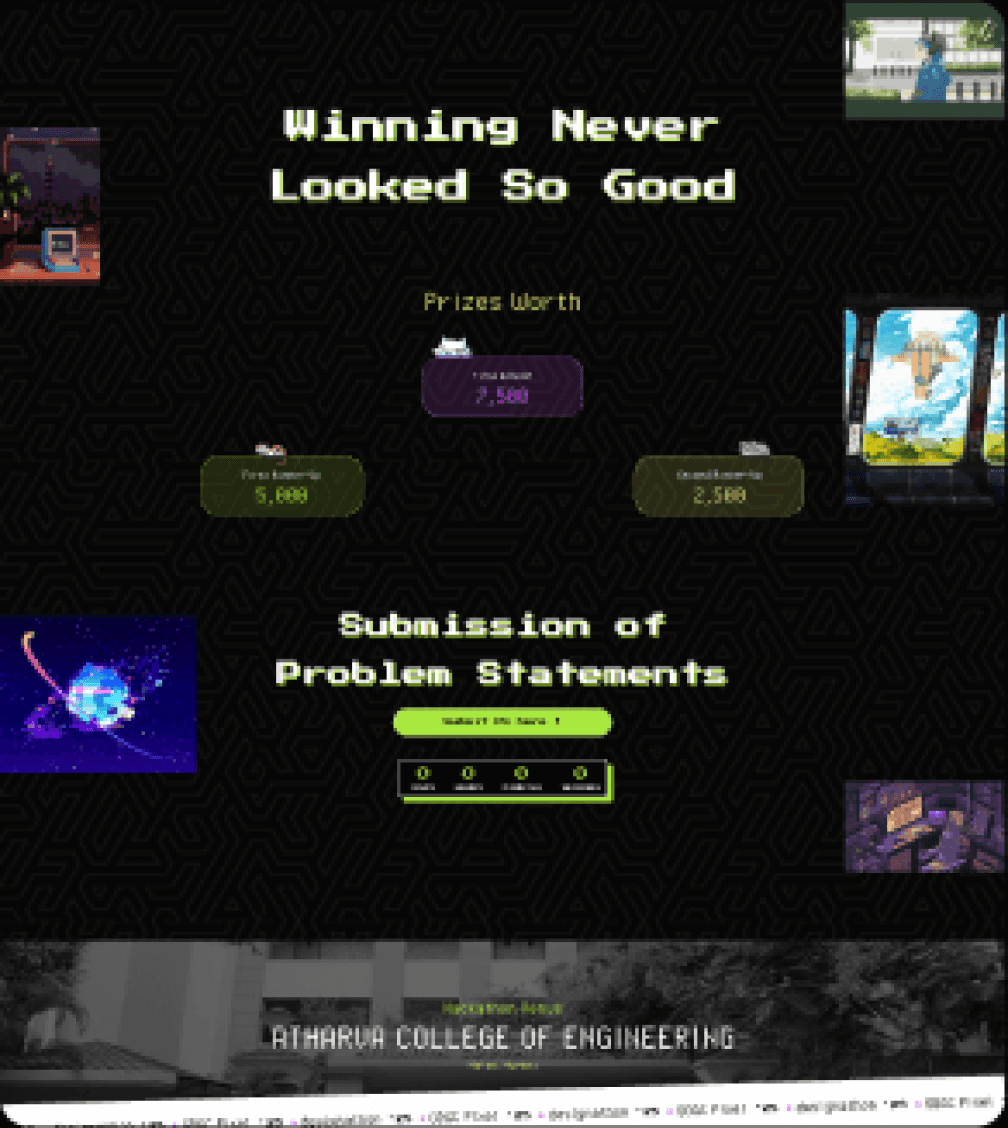
Prizes
Register CTA & Submission
Following the start of the Designathon, the website's functionality shifted from registration to submission, allowing participants to upload their completed designs.
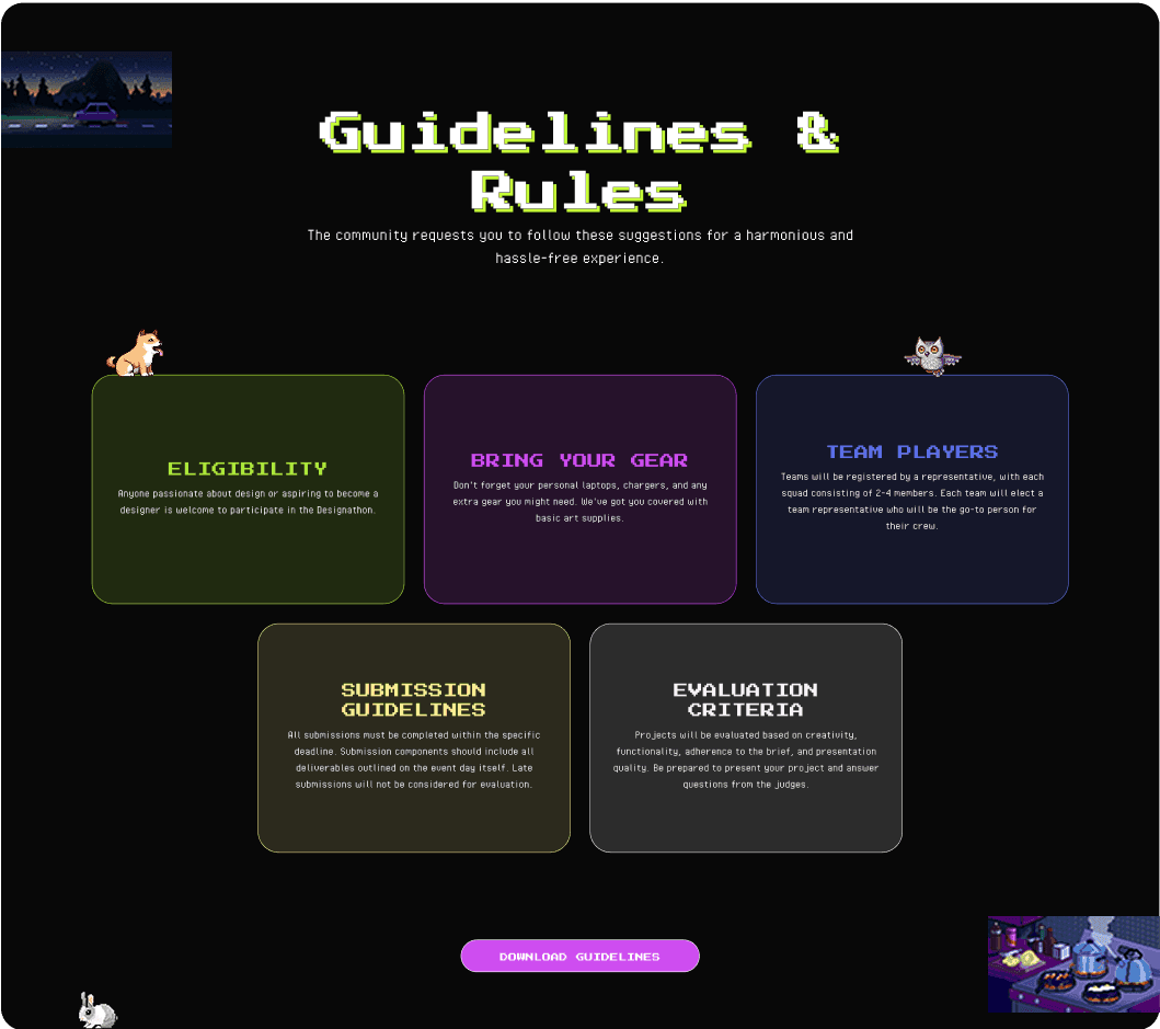
Guidelines
Downloading Guidelines
To ensure participants had easy access to all relevant information, a comprehensive PDF document was created alongside the Guidelines section on the website.
06. Closing
Journey Ends
This journey was a test of adaptability and focus, pushing me to grow in
unexpected ways. Here are some standout moments.
Winning Moments
Seamless User Experience: The website was intuitive and easy to navigate, with participants complimenting its clarity and ease of use.
Successful Onboarding: The registration and submission processes were smooth and efficient, with minimal technical issues reported.
Visual Appeal: The website's visually appealing design created a positive and engaging user experience, reflecting the creative nature of the event.
Lessons Learned
Flexibility and Adaptability: Be prepared to adapt to changing circumstances and unexpected challenges. The ability to quickly adjust plans and make necessary changes is crucial.
Value Team Collaboration: Foster a collaborative and supportive team environment. Open communication and shared responsibility are essential for project success.
Communication is Key: Maintain open and consistent communication with all stakeholders, including team members, participants, sponsors, and collaborators.

From Idea to Impact: Building the Pixel Designathon Experience
01. Overview
As UI/UX Lead of GDGC , I designed their first designathon website over one month. this platform enebled participants reistration, problem statement selection, and solution submission via UX Hack. Applying user-centered design, i delivered an intuative solution, balancing multiple responsibilities to ensure a successful event.
Note: Balancing organizing duties, I designed the website in phases over a month period.
03. Key Challenges
Chaos Meets Simplicity
Challenge
Given that this was the first design hackathon, the website's visual appeal was paramount. There was significant pressure to create a captivating online presence that would meet the high expectations for such an event.
•
High visual expectations
•
First Designathon pressure
•
Captivating online presence crucial
Solution
Realising I needed a game plan to stay sane and productive, I
turned to the 60-40 Rule to prioritise my efforts:
•
60% on the highest priority (Visual aspect)
•
40% on the second priority (Registration experience)
This wasn't a rigid rule but gave me a solid framework to
manage my time and energy effectively.
The 60-40 Rule
60
%
%
40
Weekly Breakdown
I Organized my days around 90- to 120-minute 'deep work' sessions. While surprises did pop up, I made sure to reserve at least two blocks for high-priority tasks. The rest of the day was more flexible, adapting to what team needed from me.
Monday- Friday
•
4-6 hours: In college for both lectures and managing the team
•
2-3 hours: Designing based on requirement.
Saturday-Sunday
•
Morning: Visual designs and graphic designs for posters and all
•
Afternoon: User research and planning
Dealing with Reality
No week ever went exactly as planned. Here's how I handled
the curveballs:
•
Urgent Requests: I built in a buffer during afternoon
sessions for any urgent issues. If something couldn't wait,
it got slotted in here.
•
Shifting Priorities: If a project needed more attention, I'd
adjust my 60-40 split and keep team in the loop.
•
Energy Levels: I'd tackle high-energy tasks (like creative
design work) when I was at my peak and saved less
demanding tasks (like documentation) for when I needed a
breather.
This system wasn't perfect, but it helped me keep all the
plates spinning without losing focus. Flexibility within a
structured framework was key.
02. ROLE
Managing my own expectations
Juggling core committee responsibilities, including managing team members and project tracking, made finding dedicated design and research time challenging. Despite feeling overwhelmed at times, I persevered, committed to delivering my best work. However, the design process was further complicated by the difficulty in aligning my design aspirations with the available time and resources.
Outcomes
•
Resilience and Perseverance: The project demonstrated an ability to overcome challenges, manage competing priorities, and deliver results under pressure.
•
Realistic Project Scoping: The experience highlighted the importance of aligning project scope with available time and resources for future projects.
•
Improved Time Management Insights: The challenges faced provided valuable lessons for improving time management and resource allocation strategies in future endeavors.
•
Compromise and Adaptation: The design process required compromises due to constraints, demonstrating adaptability and the ability to prioritize essential features.
05. UX DESIGN
No Scenic Route,
Just Speed
Solving core problems goes beyond design—it
starts with effective resource allocation. With a
fresh perspective, I identified key process
improvements to accelerate the work.
Understanding the problem
WHO ARE WE Targeting ?
Our user base comprises students from various colleges. Since UX design in engineering is relatively uncommon, we specifically targeted this audience.
Final year college students seeking internships or part-time employment opportunities.
Students in their second and third years of study looking to build their design portfolios
WHAT ARE WE SOLVING?🧠
Lack of opportunities: Providing a platform for these students to showcase their design skills and gain practical experience.
Limited exposure: Connecting these students with industry professionals and design mentors.
Community building: Fostering a community of aspiring UX designers within the engineering college.
Valuable Insights
Problem
Balancing Aesthetics and Usability: Ensuring the website was visually appealing while remaining intuitive and easy to navigate for first-time participants.
Clear Communication: Effectively communicating rules and guidelines through both the website and a downloadable PDF.
Streamlining Submission & Problem Statement Release: Navigating tight deadlines and resolving integration issues with our collaborator's platform, UX Hack. risked building features that might miss the mark.
Solution
Prioritized Visual Hierarchy: Implemented a clear visual hierarchy using typography, color, and spacing to guide user attention and highlight key information.
Regular Team Meetings: Conducted regular team meetings to discuss progress, address challenges, and ensure alignment with project goals.
Simplified Navigation: Streamlined the menu structure, reducing the number of clicks and making it easier for users to find the information they needed.
Payoff
Successful Event Registration: The streamlined registration process and clear communication of event details resulted in a high number of participant registrations and a successful turnout for the Designathon.
Enhanced Brand Image: The professional and visually appealing website enhanced the GDGC's brand image and credibility within the college community.
Increased User Engagement: The improved navigation, clear information architecture, and visually appealing design made the website more user-friendly, leading to increased user engagement and a higher likelihood of participants exploring the website and completing desired actions (e.g., registering, viewing problem statements).
UX Strategy
60% Of Art
Our UX strategy centres on
Aesthetic-
Usability Effect
, which states:
“Users often perceive aesthetically pleasing design as design that’s more usable.”
An aesthetically pleasing design creates a positive response in people’s brains and leads them to believe the design actually works better. People are more tolerant of minor usability issues when the design of a product or service is aesthetically pleasing.
40% Strategy
This part of UX strategy centres on Paradox of the Active User, Which states : “Users never read manuals but start using the software immediately. “
Users are often motivated to complete their immediate tasks and therefore they don't want to spend time up front reading documentation.
This paradox exist because users will save time in the long term if they take the time to optimize the system and learn more about it.
Design Foundation
The Power of Aesthetics
When users have a positive emotional response to visual design, it makes them more tolerant of minor usability issues. This effect is a major reason why a good user experience can’t just be functional. An attractive visual design isn’t just “nice to have” — it plays a critical role in how your users perceive your product.
The UX Model (Apple’s Website)
The Design
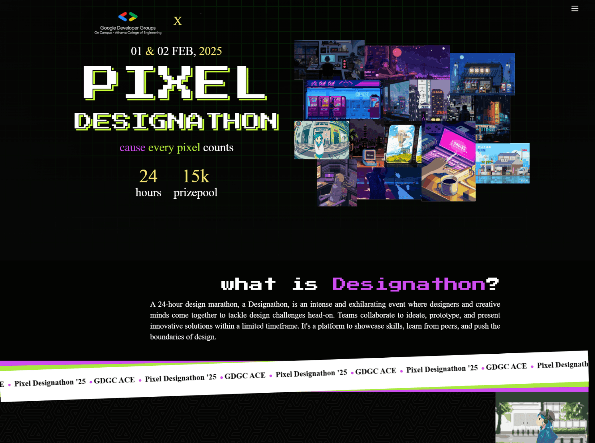
Designathon website
Typography
Pixel Operator
ABCDEFGHIJKLMNOPQRSTUVWXYZ
abcdefghijklmnopqrstuvwxyz
0123456789!@#$%^&*()
Press Start 2P
ABCDEFGHIJKLMNOPQRSTUVWXYZ
abcdefghijklmnopqrstuvwxyz
0123456789!@#$%^&*()
Font: We chose Pixel Operator and Press Start 2P for their visual similarity to our theme and flexibility. Alternative character options were selected to improve legibility.
Designathon Color Palette
Categorical Palettes
#A9E93F
green
#CE4DF0
Purple
#F4E573
Yellow
#5C6EEA
Blue
#000000
Black
#FFFFFF
White
Colours: The color palette, featuring green for success, purple for luxury, yellow for attention, blue for trust, and black & white for contrast, enhances user experience by providing clear visual cues and reinforcing brand identity.
Prizes
Register CTA & Submission
Following the start of the Designathon, the website's functionality shifted from registration to submission, allowing participants to upload their completed designs.
Guidelines
Downloading Guidelines
To ensure participants had easy access to all relevant information, a comprehensive PDF document was created alongside the Guidelines section on the website.
06. Closing
Journey Ends
This journey was a test of adaptability and focus, pushing me to grow in unexpected ways. Here are some standout moments.
Winning Moments
Seamless User Experience: The website was intuitive and easy to navigate, with participants complimenting its clarity and ease of use.
Successful Onboarding: The registration and submission processes were smooth and efficient, with minimal technical issues reported.
Visual Appeal: The website's visually appealing design created a positive and engaging user experience, reflecting the creative nature of the event.
Lessons Learned
Flexibility and Adaptability: Be prepared to adapt to changing circumstances and unexpected challenges. The ability to quickly adjust plans and make necessary changes is crucial.
Value Team Collaboration: Foster a collaborative and supportive team environment. Open communication and shared responsibility are essential for project success.
Communication is Key: Maintain open and consistent communication with all stakeholders, including team members, participants, sponsors, and collaborators.
Explore my other case studies
Explore my other case studies